
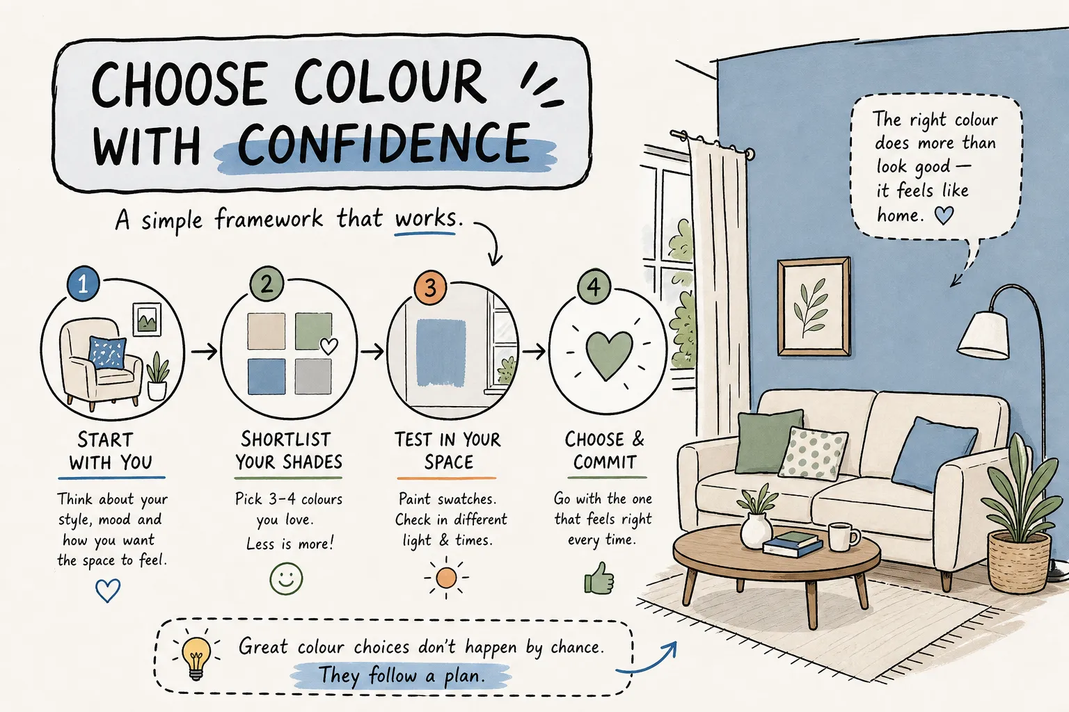
A Simple Framework for Picking the Right Interior Paint Colour
Luxe Layers · Interior Painting · Colour Guide
To pick the right interior paint colour, start with the room’s fixed elements and desired mood. Then evaluate the lighting and undertones, test large samples on the actual walls, and choose a finish suited to the room’s function. This seven-step framework helps turn an overwhelming swatch wall into a manageable decision.
A common reason paint decisions go sideways is that homeowners visit the paint store before assessing the room. A small chip under store lighting cannot show how a colour will look beside your flooring, trim, and furniture. For Vancouver homes, the contrast between bright summer days and grey winter afternoons makes testing in your own space especially useful.
At Luxe Layers, we help homeowners work through colour choices before painting begins. Whether you are planning a bedroom update or a complete repaint, this guide gives you a practical starting point.
Choose colour with confidence
Start with the room
Choose the mood first, then work with your flooring, cabinetry, tile, and furnishings.
Test in real light
Compare undertones and large samples in daylight and after dark. Live with them for 24–48 hours.
Match the finish
Choose the paint product and sheen for the surface, cleaning needs, and moisture exposure.
1. Define the Room’s Mood Before Picking a Shade
Colour is a tool for creating a feeling. Calm, warm, bright, dramatic, and cosy rooms each suggest a different starting palette. Soft, muted colours can support a restful atmosphere; deeper tones and stronger contrasts can create drama. These are starting points, rather than rules: your preferences and the room itself matter most.
A bedroom meant to feel restful does not require you to evaluate every green in the store. Start with the mood, then narrow the range of lightness, warmth, and saturation you want. Collect a few reference images and look for the qualities they share instead of trying to copy a colour from a screen.
2. Start with What You Cannot Easily Change
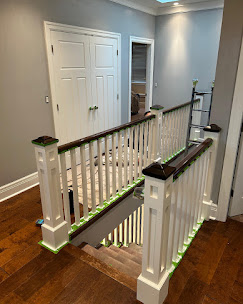
Flooring, cabinetry, countertops, tile, built-ins, and large furnishings are your palette anchors. These materials already have colours and undertones. Your wall colour should work with them rather than being chosen in isolation. The more permanent or expensive a finish is to replace, the more weight it deserves in the decision.
For example, warm honey-toned cabinets and cream tile create a different starting point from cool stone flooring and white cabinetry. Bring material samples or clear photographs when shortlisting paint, then check the actual paint samples beside those finishes at home.
3. Assess How Lighting Affects Interior Paint Colour
The same paint can look noticeably different depending on window direction, time of day, nearby surfaces, and artificial lighting. Understanding these conditions before sampling helps explain why a shade you liked in the store may look different on your wall.
Natural light and room orientation
- North-facing rooms: cooler, indirect daylight can make some pale colours appear cooler.
- South-facing rooms: stronger daylight may brighten colours and intensify warm tones.
- East-facing rooms: warmer morning light gives way to cooler light later in the day.
- West-facing rooms: late-afternoon sun can make colours feel particularly warm.
Trees, neighbouring buildings, overhangs, and window size can change these patterns. In Vancouver, shorter winter days also mean more time under artificial light. View samples on an overcast day as well as a sunny one when possible, and consider when you use the room most.
Artificial light and bulb temperature
Warm bulbs, often around 2700–3000K, add a warmer cast. Neutral bulbs sit between warm and daylight options, while higher-temperature bulbs tend to look cooler. Colour rendering also varies between bulbs, so colour temperature alone will not predict the result.
Always view samples under the room’s actual fixtures after dark. If you plan to change the lighting, settle that choice before making your final paint decision. A colour you like at noon may feel different under your evening lamps.
4. Check the Paint’s Undertones
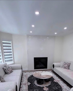
An undertone is the secondary colour you notice beneath a paint’s main appearance. A grey may lean green, violet, or blue; a beige may look pink, yellow, or orange. These subtle differences often explain why two seemingly similar neutrals behave differently in the same room.
How to spot an undertone
Compare samples against a neutral white or grey and against one another. Darker shades on the same paint strip can offer clues, although not every strip follows a single undertone family. The most useful comparison is still beside your actual flooring, tile, trim, and countertops.
Check whether a sample makes an existing finish look unexpectedly pink, yellow, or dull. If the combination feels uncomfortable in the room, choosing a different paint is usually simpler than trying to compensate with accessories later.
Match, complement, or contrast deliberately
Undertones do not always need to match. Warm walls can balance cooler furnishings, and cooler walls can sit comfortably with warm wood. What matters is that the relationship looks intentional. Identify the tones already present, then decide whether you want harmony or a controlled contrast.
5. Test Large Paint Samples in Your Space
Paint chips give you a direction; large samples help you make the decision. Shortlist three to five colours, then narrow further if the options become difficult to compare. A three-to-four-colour shortlist is a useful way to keep this stage manageable.

Sample size and placement
Aim for a sample around 18 × 24 inches on the wall or a movable sample board. Follow the sample product’s application instructions, including the recommended number of coats and drying time. Check it on a bright wall, in a darker corner, and beside the main fixed finishes.
Movable boards are helpful when you want to compare several walls without leaving patches everywhere. Keep in mind that sample paint may use a different sheen or formulation from your final coating; confirm the selected product and finish before ordering.
Live with samples for 24–48 hours
Observe your shortlist in the morning, at midday, in the afternoon, and after dark. Allow the paint to dry fully before judging it. Notice which option stays comfortable under the conditions you actually live with, rather than choosing the one that looks best for a single hour.
Online paint visualizers can help narrow ideas, but screens cannot reproduce your room’s real lighting, texture, or sheen. Treat them as a planning tool rather than a substitute for physical samples. See Benjamin Moore’s paint sample guidance for more about differences between sample formats and applied paint.
6. Choose a Paint Finish That Suits the Room
Finish is both a visual and practical choice. Higher sheens generally reflect more light and make surface defects more noticeable. Lower sheens can soften the appearance of minor imperfections. Washability and moisture resistance depend on the specific product, not just its sheen name.
A practical guide to common finishes
| Finish | Appearance | Durability and cleanability | Rooms and surfaces |
|---|---|---|---|
| Flat / matte | Low reflectivity; helps soften texture and minor flaws | Washability varies by product; check cleaning guidance | Ceilings, bedrooms, and low-sheen living areas |
| Eggshell | Soft, subtle lustre | Often suited to routine light cleaning; product dependent | Living rooms, bedrooms, dining rooms |
| Satin / pearl | More noticeable sheen; may reveal wall flaws | Often chosen for surfaces needing regular cleaning | Busy rooms, hallways, kitchens; use a suitable product |
| Semi-gloss | Reflective finish that highlights preparation quality | Often washable; moisture performance varies by coating | Trim, doors, selected cabinetry and moisture-prone surfaces |
| High-gloss | Strong reflectivity; requires a very smooth surface | Often easy to clean; confirm the specific coating | Accent details, trim, and selected cabinetry |
Paint finish comparison. Sheen names and performance vary by manufacturer and product.
Choose a coating for kitchens and bathrooms
For kitchens and bathrooms, choose a coating rated for the intended moisture and cleaning conditions. A bathroom does not automatically require semi-gloss, and a matte label does not automatically mean a paint cannot be washed. Sheen names also vary between manufacturers, so review the exact coating with your painter.
7. Build a Cohesive Colour Palette for the Whole Home
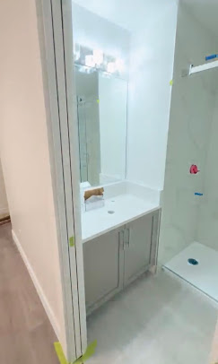
A cohesive palette does not mean painting every room the same colour. It means giving the rooms a recognisable connection. Shared undertones, repeated accents, or consistent trim can help spaces feel related while allowing each room to have its own character.
Use the 60/30/10 rule as a starting point
The 60/30/10 approach suggests roughly 60% dominant colour, 30% secondary colour, and 10% accent. Think of the main walls and large furnishings as the dominant group, supporting furniture or curtains as the secondary group, and artwork or cushions as accents. These proportions are a design aid, not a strict formula.
For a whole home, begin with a small set of main colours and vary their depth rather than choosing unrelated shades for every room. View your samples together and from doorways where adjoining spaces are visible.
When rooms should share a colour
Shared tones are useful in open-plan rooms, hallways, and transition spaces. A consistent trim colour can also link rooms even when the walls change. Bedrooms, enclosed powder rooms, and rooms with distinct lighting can take a different direction while keeping a repeated accent or finish that connects them to the rest of the home.
Your Interior Paint Colour Checklist
- Define the mood you want.
- Identify the room’s fixed materials and furnishings.
- Assess daylight and the lighting you use after dark.
- Compare undertones beside the existing finishes.
- Test large samples over at least 24–48 hours.
- Confirm the exact paint product and sheen.
- Check how the colour relates to adjoining rooms.
Work through the steps in order and the decision becomes more focused. You do not need to find a universally perfect colour; you need one that works with your room, your lighting, and the way you want to live in the space.
Need Help Moving from Colour Planning to Painting?
Once you have narrowed your palette, surface preparation and application determine how the finished room looks. Minor repairs, clean edges, and consistent coverage help bring the colour choice together.
Our interior painting services in Vancouver include colour consultation, preparation, and painting for individual rooms or complete interiors. Explore our residential painting services or request a free estimate to discuss your project with Luxe Layers.
Frequently Asked Questions
Can a paint visualizer replace real paint samples?
A visualizer is useful for narrowing a shortlist, but it cannot reproduce the exact appearance of paint in your room. Confirm your choice with large physical samples viewed under your own daylight and fixtures.
Which paint finish hides wall imperfections best?
Flat and matte finishes generally make minor texture and imperfections less noticeable because they reflect less light. They do not repair damage, so preparation still matters. Choose a product with the cleaning performance needed for the room.
Can I choose paint colours in summer for a room used mostly in winter?
Yes, but check the samples after dark and during duller weather as well as in strong daylight. Artificial light cannot fully recreate winter daylight, so allow for seasonal differences and avoid making the decision from a single sunny-day viewing.
Does using the same trim colour help rooms feel cohesive?
Yes. Repeating the trim colour creates a consistent detail between rooms. Related wall undertones, repeated accent colours, and a coordinated ceiling treatment can provide additional connections without making every room identical.