
Small room paint ideas that make tight spaces look bigger
The most reliable small room paint ideas share three traits: a light-reflective wall color with an LRV above 65, a ceiling that reads slightly lighter than the walls, and a finish, eggshell or satin, that adds glow without glare. Add a low-contrast trim choice and those boundaries between surfaces practically disappear. Luxe Layers has 20 years of experience painting condos and houses across Vancouver.
This guide covers every variable: color family, specific brand shades, ceiling and trim combinations, finish choices, and when dark colors actually help. By the end, you’ll have a clear plan before you walk into a paint store.
Key takeaways
LRV is your starting point: Colors with an LRV above 65 reflect enough light to prevent walls from feeling dominant. Aim for LRV 70–85 on walls and 80+ on the ceiling.
Ceiling color matters: A ceiling one shade lighter than the walls draws the eye upward and increases perceived height without any structural work.
Low-contrast trim opens the room: Trim that matches or barely contrasts the wall color removes visual frames that emphasize a room’s boundaries.
Eggshell is the default wall finish: It reflects enough light to brighten a small room while hiding surface imperfections better than satin.
Dark colors can work: Color drenching, walls, ceiling, and trim in one shade, makes boundaries recede and can make a small room feel like a jewel box.
Always sample on the actual wall: Paint a large sample directly onto the wall and check it in morning, afternoon, and artificial light before committing.
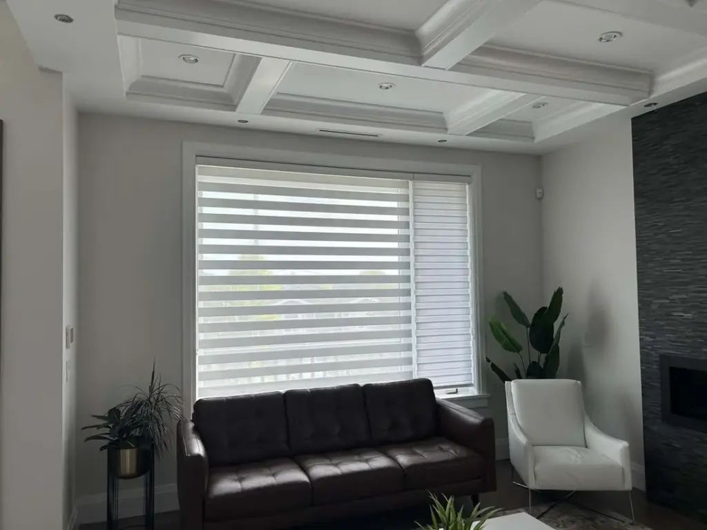
Small room paint ideas: what colors actually make a space feel bigger?
Understanding LRV and why it matters for small spaces
LRV (Light Reflectance Value) measures how much light a color bounces back, on a scale from 0 (pure black) to 100 (pure white). For small rooms, colors above LRV 65 are the reliable threshold: they reflect enough light that wall boundaries feel less dominant and the room reads as larger. Sherwin-Williams identifies colors above LRV 65 as reading as expansive on walls, a guideline consistent with professional color practice. Push toward LRV 80–92 in dark or north-facing rooms, and LRV 65–75 when the room gets decent daylight.
Higher LRV doesn’t automatically mean white. Pale greige, misty blue-gray, and soft sage can all clear that bar while adding real color and personality to the space.
The color families that reliably open up tight spaces
| Color family | LRV range | Best use |
|---|---|---|
| Soft white / warm off-white | 80–92 | Dark or north-facing rooms; maximum brightness |
| Cream / pale ivory | 80–90 | Low-light rooms that need warmth without starkness |
| Mist gray / pale blue-gray | 70–80 | Bright or neutral rooms; creates a receding, airy effect |
| Pale greige | 65–75 | A softer alternative to white that still reflects substantial light |
| Muted pale blue or sea-foam green | 60–75 | Adds color while retaining an open, light feel, works best with strong natural light to compensate for the lower LRV floor |
| Light sage | 60–68 | Rooms where a little depth is desirable without heaviness, pair with generous daylight or high-output lighting |
Note: The last two families dip below the LRV 65 threshold in their lower ranges. They can still perform well in small spaces when natural light is generous; in darker rooms, stay toward the higher end of each range or choose a family with a higher LRV floor.
Muted, low-saturation versions of any of these families outperform vivid interpretations in small rooms. A soft sage at LRV 65 reads completely differently from a vivid grass green at the same number: the saturated version advances, while the muted one recedes. One common misconception worth correcting: stark white is not always the best call. A slightly warm off-white often looks brighter and less harsh once it’s on the wall.
Warm whites vs. cool tones: matching color to your room's light
This is the most overlooked decision when choosing paint colors for small rooms. Cool or weak daylight suits warm whites and creams; bright, south-facing rooms handle pale blue-gray and soft greens without feeling cold. Test a large sample in both morning and afternoon light before committing, since undertones shift dramatically with the sun angle and bulb temperature.
Small room paint ideas: which specific shades are worth testing?
Benjamin Moore picks for small bedrooms and living rooms
White Dove OC-17 is the most versatile starting point, a warm off-white that feels brighter than stark white without a yellow cast. Glass Slipper 1632 delivers a soft, airy blue that suits small bedrooms with reasonable natural light. Pristine OC-75 reads as a crisp near-neutral that keeps rooms feeling open, while Pale Oak OC-20 is a warm greige that works well in compact living rooms, particularly with wood floors and linen upholstery.
For rooms where coziness is the goal and natural light is generous, Chelsea Gray HC-168 and Aegean Teal 2136-40 add depth and mood without overwhelming the space. These are deliberate choices for a specific effect, not defaults for every small room.
Sherwin-Williams and Farrow & Ball options
From Sherwin-Williams, Alabaster SW 7008 is a go-to warm white for small bedrooms with just enough warmth to feel settled without going yellow. Upward SW 6239 pairs well with linen and white trim as a calm blue, while Rainwashed offers a soft green-blue alternative for anyone who wants a little more color presence.
From Farrow & Ball, Joa’s White and Wimborne White No. 239 are warm off-whites with quiet depth. Setting Plaster adds a soft pink-neutral warmth that doesn’t weigh on a compact room, while Plummett suits a bedroom where deliberate intimacy is the target. All of these look substantially different from a chip than from a painted wall, so sampling is never optional.
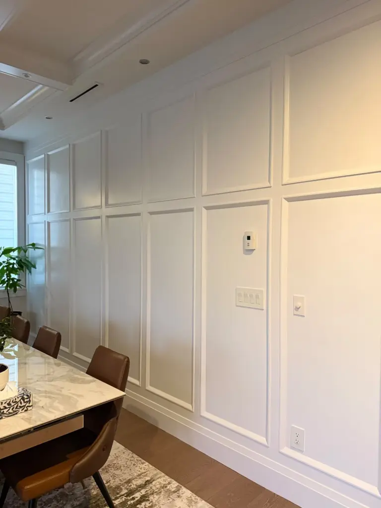
How do ceiling and trim choices change the picture?
The ceiling rule that adds height without lifting a hammer
A ceiling painted one shade lighter than the walls, or in a soft matte white when the walls are a mid-tone, draws the eye upward and stretches the perceived height of the room. For the strongest result, keep the ceiling LRV above 80.
A matching ceiling (same color as the walls) creates an enveloping, cocoon-like effect that works for intentional coziness, but it does reduce the sense of vertical space. Avoid a stark white ceiling above colored walls unless the contrast is purposeful; too much jump between wall and ceiling fragments the room rather than expanding it.
Trim color: blend it, match it, or barely contrast it
Sharp white trim against colored walls draws a hard frame around the room and emphasizes its outline. For small spaces, trim that matches the walls or sits only slightly lighter helps surfaces read as continuous. A satin finish on trim next to a matte or eggshell wall creates enough visual differentiation without the interruption of high contrast.
In very compact rooms, hallways especially, painting doors and trim the same color as the walls removes visual stop points and makes the space feel longer. It’s a straightforward technique that costs nothing extra and delivers a noticeably more expansive result.
Accent wall ideas for small rooms: when and where they work
An accent wall works in a small room when it creates depth rather than visual chop. The most effective placement is the far wall of a narrow room: a deeper shade on the end wall makes it recede, increasing perceived depth. Avoid accent walls on side walls in tight spaces; they interrupt the room’s length instead of extending it.
For a small bedroom, the wall behind the headboard is a low-risk option, particularly with a tone only two or three shades deeper than the other walls. Keep the transition subtle and the effect stays cohesive rather than abrupt.
Best paint finishes for small room paint ideas
Eggshell and satin: the small-room sweet spot
For most small room walls, eggshell or satin strikes the right balance. Eggshell has a subtle glow that gently reflects light while remaining nearly shine-free, making it practical for bedrooms, living rooms, and hallways. Satin reflects more light and adds slight visual depth that can make a narrow room feel wider; it’s also more washable, though it reveals surface imperfections more readily. Both are stronger choices than flat for any wall that needs to feel bright and open.
Where semi-gloss helps (and where it creates problems)
Semi-gloss reflects substantially more light, which sounds appealing in a small room, but on walls it can produce glare and amplify every dent and brush mark. Use it on trim, doors, and cabinetry where durability and cleanability matter. In moisture-prone areas like bathrooms, semi-gloss or satin on walls is the right call regardless of room size.
Pairing a low-sheen wall color with satin or semi-gloss trim creates a subtle three-dimensional effect that makes the room feel more considered. In a very dark or dim small room, a light satin or eggshell on the walls distributes more light than a flat finish would, so the finish choice has real impact beyond just aesthetics.
Can bold or dark colors work in a small room?
The color-drenching method explained
Color drenching means painting the walls, ceiling, trim, doors, and built-ins in the same shade or closely related tones. By removing the color contrast between surfaces, corners recede, edges soften, and the room reads as a single cohesive volume rather than a series of boundaries. This is the technique that makes a deep navy or slate-green small bedroom feel like a jewel box rather than a closet.
The key is choosing the color according to the room’s light. In dim rooms, a rich mid-tone, olive, slate blue, warm plum, works better than an extremely dark shade. In a naturally bright room, deeper colors can create a comfortable, enveloping effect without feeling oppressive.
Strategic placement of deep colors in tight spaces
In a narrow room or hallway, a deep blue, green, or charcoal on the far wall makes it visually recede and increases perceived depth. Keep adjacent walls lighter to avoid a tunnel effect. In a small living room, a saturated olive or slate-toned wall pairs well with a light sofa and warm wood flooring. The color supplies depth while the lighter furniture preserves visual breathing room.
Lighting and accents that stop dark rooms from closing in
Layered lighting is essential in a dark-walled small room. Combine overhead lighting with task lights and accent lamps, and choose warm-toned bulbs that complement dark, saturated wall colors without making the room feel oppressive. Bright accents, white bedding, pale rugs, brass or polished metal fittings, large mirrors, reflect light and prevent the scheme from going flat.
The 60:30:10 principle applies here: let the wall color own 60% of the visual field, use a quieter secondary tone (wood, cream, linen) for 30%, and keep a vivid or contrasting accent to around 10%. That balance keeps the room feeling intentional rather than heavy.
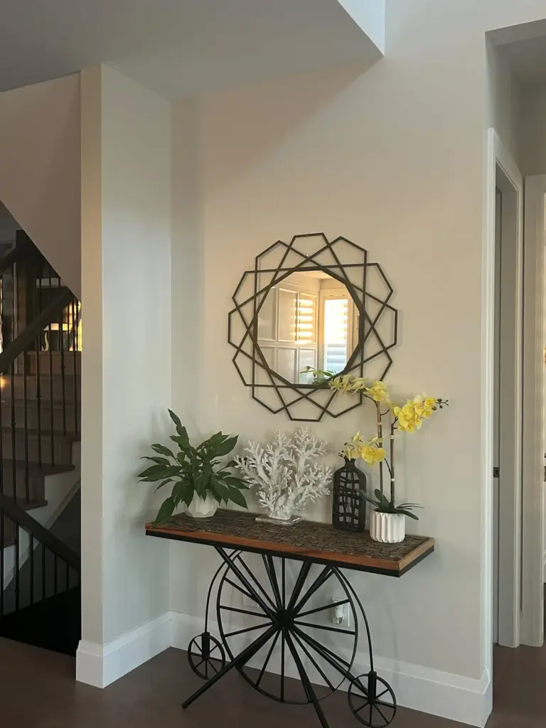
Sampling, testing, and knowing when to ask for help
How to sample paint colors correctly
Paint a large sample directly onto the wall, not on a card or a separate piece of board. View it in morning light, afternoon light, and under your artificial lighting in the evening. The same pale blue-gray that reads as fresh and open at noon can shift toward purple under warm bulbs at night.
Test at least three options side-by-side before committing. This step is never optional for small rooms, where the wrong undertone fills the entire space and there’s nowhere for it to disappear.
When a professional color consultation saves time and money
Choosing between shades that look nearly identical on chips but behave differently on walls is where most homeowners lose confidence. At Luxe Layers, color consultation is built into the estimate process: before any work begins, our team walks through the room’s specific lighting conditions, flooring tones, and how you actually use the space to recommend shades that will work once the paint dries, not just on a chip under a store’s fluorescent lights.
Put these small room paint ideas together before you pick up a brush
Small room paint ideas work best when color, finish, ceiling, and trim decisions are made as a system rather than individually. Start with LRV and undertone, pick a finish that adds glow without glare, treat the ceiling as part of the palette, and don’t rule out deeper shades if the light and the goal are right. Sample everything on the actual wall and view it across different times of day before you commit.
If you’re working through a condo refresh, a pre-sale repaint, or a bedroom that just hasn’t felt right in years, our team at Luxe Layers is ready to walk through it with you. We serve homeowners, condo owners, and strata properties across Vancouver, and we bring the same careful preparation and color guidance to every project. Reach out for a free estimate and we’ll help you arrive at the right palette before a single drop of paint goes on the wall.
Frequently Asked Questions
Do you include a professional colour consultation in your estimate?
Yes, we include a color consultation as part of the estimate process. Our team walks through the room’s lighting, flooring tones, and how you use the space to recommend shades that will work once the paint is on the wall.
Can trim be a different finish than the walls to keep the room feeling continuous?
Yes, trim in a satin finish next to a matte or eggshell wall creates subtle differentiation without high contrast. That approach lets surfaces read as continuous while giving a slight three-dimensional effect that feels considered rather than framed.
Will painting doors and trim the same colour as the walls make a hallway feel longer?
Yes, painting doors and trim the same colour as the walls removes visual stop points and makes compact hallways feel longer. This low-contrast approach opens the space without any structural changes.
Do you work on condos and strata properties in Vancouver?
Yes, we serve homeowners, condo owners, and strata properties across Vancouver. We offer the same careful preparation and colour guidance for condo refreshes, pre-sale repaints, and bedrooms that need an update, and we provide a free estimate to get started.